2024 Friends & Family Email Campaign
This year for HALL, WALT & BACA Wines’ Friends & Family campaign, I wanted a simple black and white color palette with a bright WALT red accent. A new typeface was introduced for this campaign and I made social posts and ads that followed this look and feel. (PMax ads used the same photography but not design.) New this year, I created a Spotify playlist for the campaign and also included some recipes. Overall, I like how the photography is showcased and how the campaign at a glance shows the breadth of the sale, while still keeping the design clean and simple.

HALL Family Wines Emails
I design emails for three brands HALL, WALT & BACA Wines with a variety of messaging. In addition to promoting different wines, emails are sent to encourage visitation and let customers know about selections that are selling out. As previously shared, I strive to create emails with unique designs that excite the viewer. Occasionally I will use a typeface that is not part of a brand’s guidelines to make a solution more interesting. I also use interesting layouts and different textures to bring energy to the design.

2022 Kathryn Hall Harvest Celebration
For the 2022 Kathryn Hall Harvest Celebration, the theme was California Dreamin’. I was inspired by our beautiful grounds at the winery and HALL Family Wines brand colors. This design was used for the event t-shirts as well as a floor decal.

Harebrained Wines
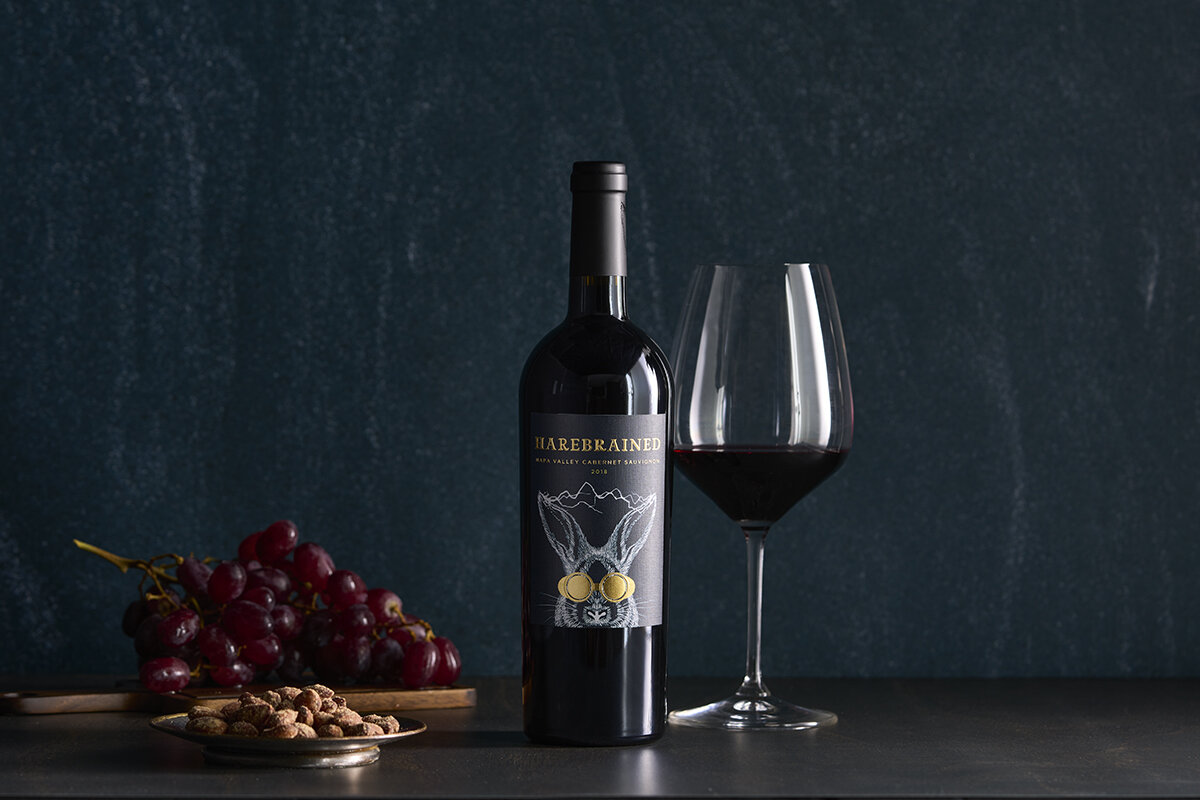
This was an incredible project with a short lead time. We started working on the label. There were many rounds exploring color, type, and looks for the rabbit. This final iteration was one of my favorites from the beginning of this process. After this design was approved, I was in charge of designing the case box, cork, and capsule. Most recently, I have completed the first version of the website.

BACA Launch Party Invite
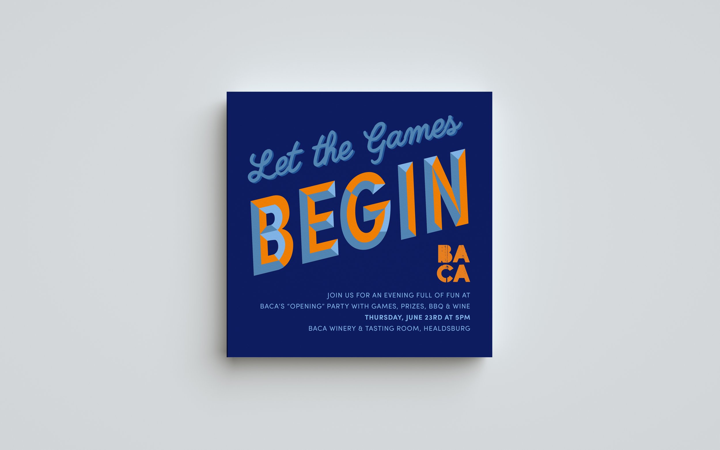
I had so much fun designing this! The “BEGIN” was particularly a great process—I had never done anything like that before. This was for BACA’s Launch Party at the Healdsburg tasting room.

The T-Bin
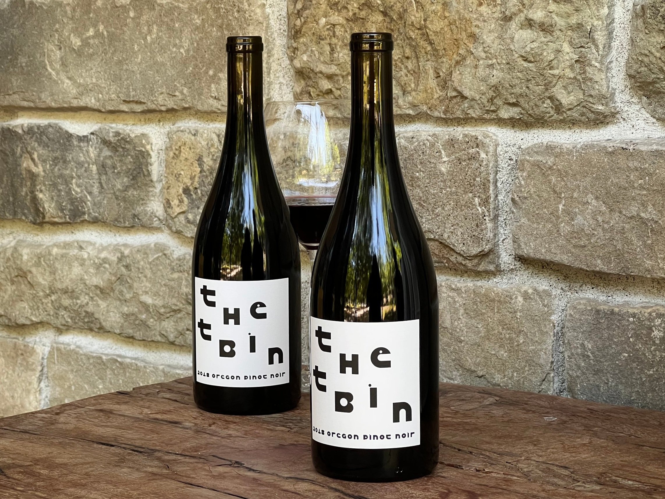
This was a fun project where I was given carte blanche to be as creative as I wanted! Though I loved some of the early designs in the process (dubbed “Very retro chic!” by my boss), I was happy with the simplicity of this label. The typeface had so much character! I did have to modify it slightly because of readability issues. Fun fact: These Oregon Pinot Noir grapes were fermented in a T-Bin, which is like a large macro bin—or as my boss described it, “Sort of like bathtub gin.”

Vine Trail Vintner Collection
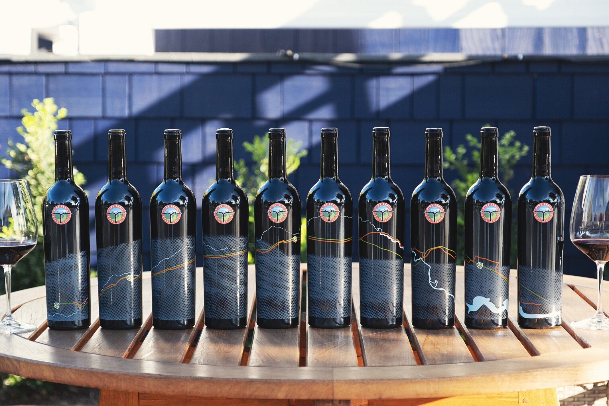
This was a fun project supporting the Napa Valley Vine Trail! I did the bottle design, art directed the photography for the project, and created a GIF in Adobe Premiere (a first for me).

HALL Napa Valley Collection Labels
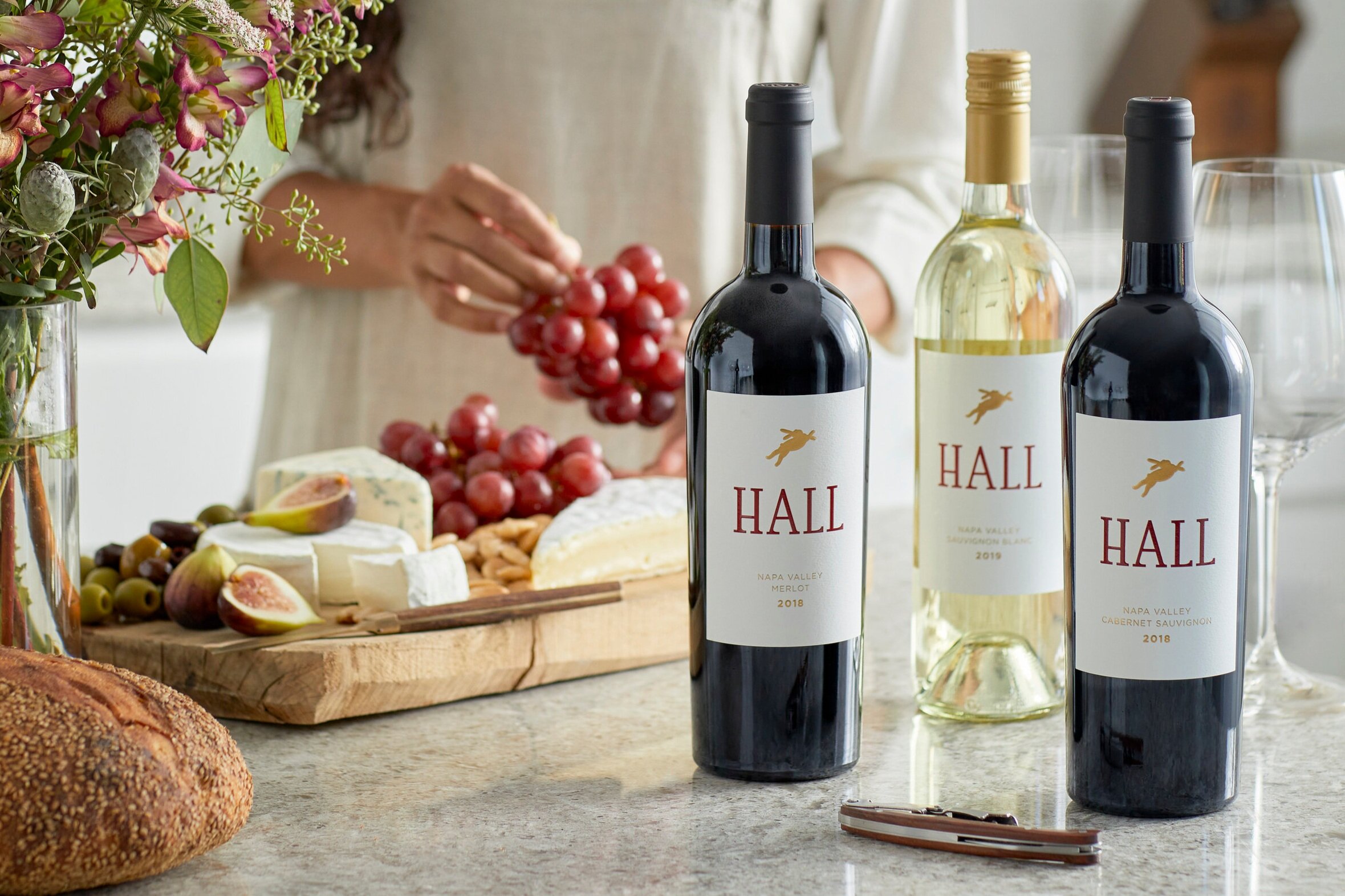
The marketing team was presented with a challenge to create a label that would stand out in a grocery store and restaurant line up. Many different solutions were explored—including going a more bold, colorful route. Thinking about HALL’s current consumers, it was ultimately decided that gradual steps would be taken in updating the design. Therefore, paper and printing processes were critical components to making the label refresh a success. I wanted a bright white stock with subtle texture to showcase the art and make this collection more modern. I wanted to keep the HALL red from the previous version of the label, and the president requested gold foil. We worked with our printer to explore different textures to suggest the look and feel of HALL’s iconic Bunny Foo Foo art sculpture by Lawrence Argent.

2020 Hall Family Wines Friends & Family Campaign
Each year I explore different ways to present Hall Family Wines biggest annual sale. The 2020 campaign colors where inspired by a couple of the National Park color palettes.

Big & Blue, 2019
Finding Nemo is a nostalgic movie for me. I enjoyed playing with the type and creating the ocean background.
Bubbles: So, the Big Blue. What's it like? Nemo: Umm... big... and blue? Bubbles: I knew it.

HALL Family Wines Logo
This logo is inspired by the incredible designer, Saul Bass. I wanted there to be a hidden “H” in the design, so it would be consistent with the logos of other HALL businesses. The Halls are art and wine enthusiasts. I knew wine would somehow have to be depicted, and hopefully it could be done in an “artistic” way. It was a year and half long process. This particular design was in the running since the beginning, and a personal favorite.

Rainin Vineyard Label
This was a request from HALL Wines president, Mike Reynolds. He wanted to update the existing Rainin Vineyard label to be more in line with the other labels in the Platinum Collection. It was a fun exercise. I drew a lot of clouds. We went through rounds of different thicknesses, trying to get the right feel for it. We explored adding a vineyard icon after the "N." A vineyard could be depicted in so many different ways. But we finally decided that we just wanted to show the name of the vineyard. It took about a year and half for it to come to fruition, but I am so excited with the final product!

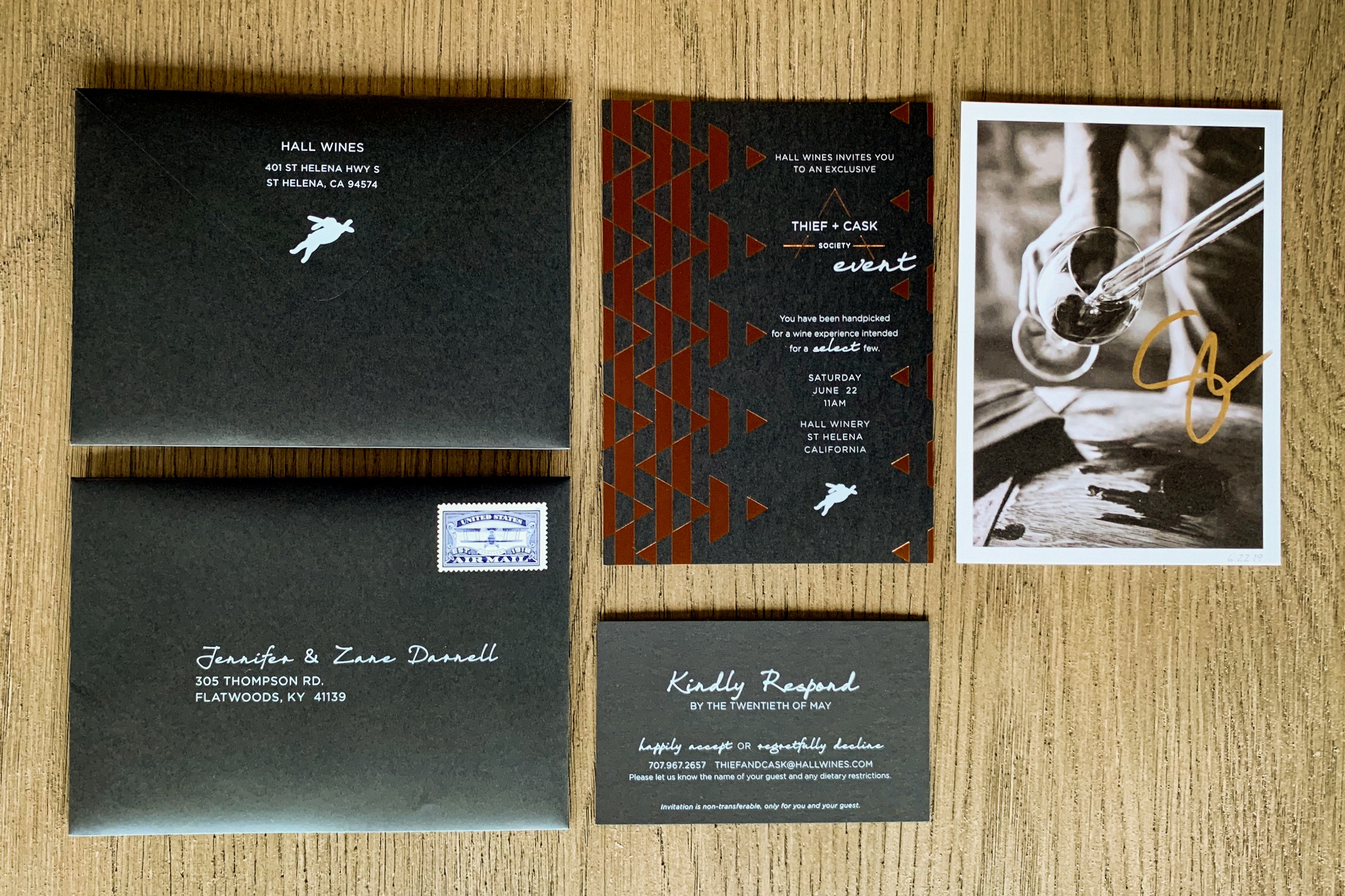
2019 Thief & Cask Invitation
HALL Wines rebranded the Top Buyer event to Thief & Cask Society event. The new branding was developed last year. It took a lot of my original Top Buyer typographical elements but now has a new logo. The triangle shape is a theme I felt needs to carried through each iteration of the invitation. This second year take was based on a chevron pattern. The email had the same look and feel. I wanted to continue the postcard concept that was introduced last year, but I wanted to add value. I wanted it to be a piece that our Thief & Cask members cherish and collected. I started the series with an autograph from HALL’s Vice President of Winemaking, Steve Leveque. I hope next year to feature HALL’s President, Mike Reynold.

Brandon Maxwell Runway Show Collateral Piece

2018 Fall Apparel Design
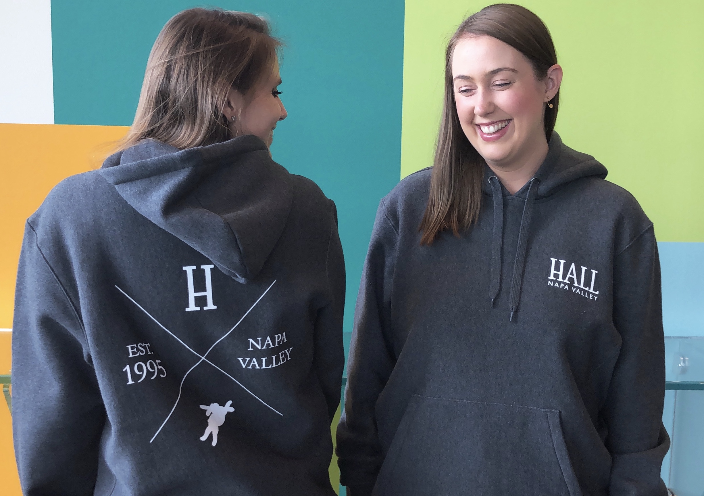
I loved designing this fun “hipster” sweater for the HALL St. Helena tasting room. I worked with the Hospitality Director and the company President to develop a design that was modern and simple.

2017 Top Buyer Invite
This was the 2017 direction for HALL | WALT's Top Buyer event. I had the pleasure of working with Katelyn from PaperPlum. She helped make my dream scenarios a reality. It was a very fun project - a little bit rushed. But because I had done last years, I knew what to expect. I was given a bigger budget, so we took the invites a step above the previous year. We foil stamped the invites as well as the RSVP cards. With Katelyn's knowledge and connections, we were able to print white on the black paper envelopes. While working on this project, I learned how to mail merge using InDesign - it was very educational.

WALT Zip Pouch
This was a quick project. Our vendor designed the first round. I finessed all the details of the front and back of the pouch. The challenge was the inside pattern - the layout was a "step and repeat" of our logo. I explored using our logo with a more purposeful layout. But I felt that I could push it. I was inspired by high-end brands and started fiddling with the "W" icon. The result was an elevated pattern that in turn was playful and unique, unlike anything we have done before.

WALT Chocolate Bar
The WALT chocolate bar was one of my first projects as an intern at HALL | WALT. This project is near and dear to my heart because in college I also did a chocolate bar project in Cliff Rusch's class. It was a very familiar experience that help me feel comfortable with my design skills. I presented over 20 design options and we narrowed it down to about 3 which were then presented to the WALT tasting room manager. This was the winner!
(Just to note: I could only design the front part of the label. The black border was required. It was tricky designing within these constraints. It definitely dictated how the information was laid out.)

RMA: Design & Photography Logo
This was the logo I created for my business many moons ago. It was inspired by the children of a family I used to babysit for. Robbie, Maggie, and Ali were a huge part of my life at that point in time. It is wonderful to have them a part of my life in this way.

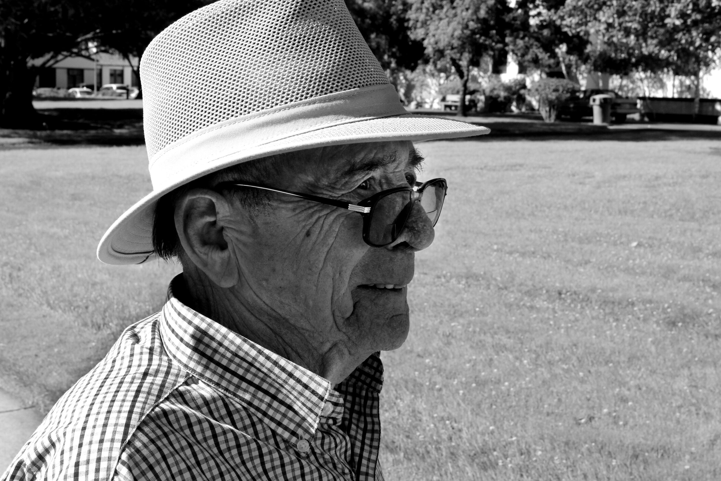
Al Weber, WWII Vet, 2013
This was a serendipitous meeting. I was walking at the Veteran Home of California in Yountville, and met this wonderful human. Al was born in 1926 and served in World War II. We had lunch a few times after this, but I haven’t seen him since. I still think of him often—this is one of my favorite images I have ever photographed.

Global Warming, 2012
This was such a spontaneous idea! I do not even remember the prompt, I just remember running to the Dinning Commons and purchasing Ben & Jerry’s, Reese’s, and KitKats. I am not sure I even knew what I was going to do with all the treats until I walked by a puddle. It was a classic “aha” moment—continues to be a favorite.

Holga Vision—Yucatán Peninsula
This was my first trip to Mexico with my photography professor, Tom Turner, and a few of my classmates (we would take the same trip again). I brought my Holga and loved the quality of the images. These images are from Akumal, Tulum, and Izamal.

Napa Valley Bath Co. Core Lines
This was a big project and one of the first projects to be professionally printed by Napa Valley Bath Co. I discussed the overall look with the owner. We took some of the labels I was working on and sat in the space that would be the first retail store. We really looked at all the details to make sure the feel was right for the store the owner had envisioned. Organization and attention to detail was key for this project for many reasons (one of those reasons was all the ingredients were correct on the label). As I moved through the project, I realized we needed a secondary typeface for the brand. I chose our secondary typeface and was very involved with the choosing of the label paper stock. I went to a press check with these labels and was the final sign off on them. There was a total of 82 labels.

Eros, 2011
This painting is based on one of my favorite pieces—Greek bronze statue of Eros sleeping (3rd–2nd century B.C.) on view at The Met Fifth Avenue.


